Stitch New Feature Roundup
Often we’re so focused on working to improve Stitch that we forget to take the time to tell everyone about the most recent changes, new features, and web site improvements that we’ve actually made.
I was struck by this at our recent Global Get-Together in Monterey (which also deserves its own blog update, hopefully coming soon!), when many of the members who attended requested improvements to Stitch that were already in the product!
So, in the interests of trying to keep you all up to date with the latest changes to how Stitch works, here is a quick roundup of all the improvements that have been made to the Stitch site recently, along with a glimpse of some of the new improvements we have planned.
Enjoy!
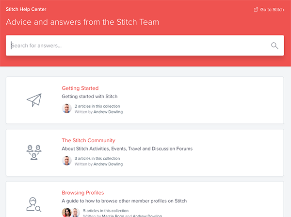
Introducing: The Stitch Help Center
This one isn’t so much a product change, but it has been a huge improvement in how new and existing members can find information about how Stitch works. We moved to a completely new support infrastructure, and re-wrote our entire support documentation set to bring everything up to date.
The result is the new Stitch Help Center, which includes guides on how to use Stitch, answers to the most common support question, and ways to get in touch with the Stitch team if you can’t find an answer to your questions.
The Stitch Help Center is now easily accessed from the More menu item in the Stitch top menu, as shown below:
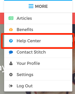
We’ve also made it easy to contact the Stitch team for any additional assistance you need, just by using the Contact Stitch item in the menu above.
Simplified Navigation
If you’ve been a member of Stitch for some time, you will have noticed that we’ve begun to streamline the site to make it easier to navigate, as well as make it easier for new members to understand how the site works.
This is an ongoing process and one which will see us release additional improvements in the coming months as we strive to make the Stitch site as easy to use as possible, but the first major change was the release of a simplified navigation menu:

This new structure helps make it easier to identify and find the most important parts of Stitch:
- The Community, highlighting everything that happens within it: Activities, Travel, and Chat (our member discussion forums)
- The ability to browse Stitch member Profiles
- Your Inbox, for all the messages you send and receive to and from other members
All other secondary items, such as member benefits, the Help Center, and your account settings, are easily accessible from a single top-level menu item.
This simple top menu replaces the animated multi-level menu we had previously, and we think makes the site a lot easier to use.
Community, Activity & Travel Design
We are currently working on a whole bunch of changes designed to improve the usability of our community pages, to make them easier to navigate and find things which are relevant to you.
The first part of this was an update to the page design for the Community Home, Activity and Travel pages. Here is a snapshot of how activities and suggestions are now presented on the Activity page:
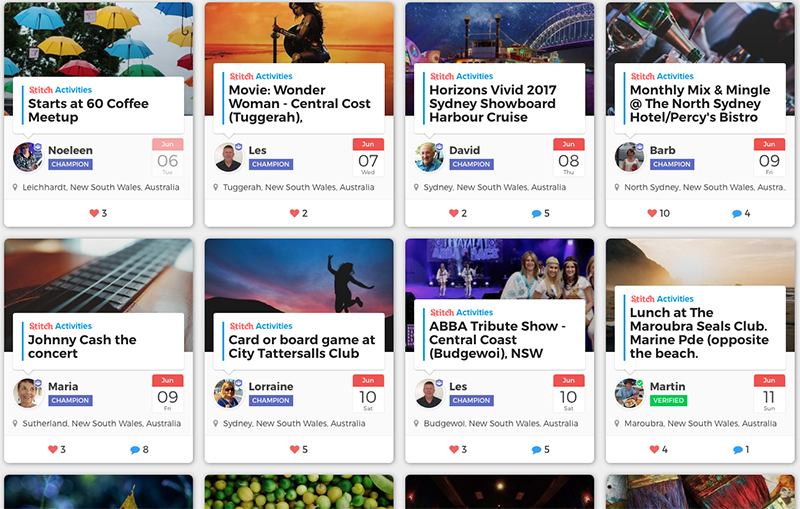
The new design lets you fit a lot more activities on a single page (which means less scrolling!), and the new grid layout makes it much easier to see the order of the events coming up. The date indicators help you see more easily when events are occurring, and we think the overall design helps highlight the wonderful members in your area who are suggesting events for you. We hope you agree!
Upcoming improvements to the search and navigation components on these community pages will make it even easier to find events you are looking for, as well as highlighting the most recent activity in the community.
Browsing History
One of the most frequently requested features for Stitch Profile Browsing was the ability to go back to look at the profiles you had previously seen. There are many reasons why you might want to do this: you might have dismissed someone accidentally; you might want to refer back to someone you tried to message; or you may simply want the opportunity to change your mind about the profiles you skipped.
That’s why we were very pleased to introduce the new History feature to Stitch Profile browsing, which can be found under the Profiles submenu as shown below:
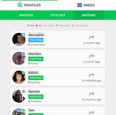
We actually launched this feature a few weeks ago, and received very quick feedback from many members that the lack of an ability to filter the history based on whether you had liked, skipped or dismissed a profile greatly limited its usability. So within a week we were able to add filtering capabilities to this page as well: just click on one of the filter items at the top of the page to narrow down your search.
Yet another example of member feedback helping us improve the way the Stitch site works: keep that feedback coming!
Miscellaneous Improvements
We’ve also released a whole raft of improvements which aren’t large enough to deserve their own section here but are worthy of mention, such as:
- Dramatic performance improvements to the Profiles page, which is now up to 5x faster to load
- Improved ability to read long conversations in the discussion forums without needing to constantly scroll the page
- Updated iPad app which now supports landscape orientation, not just portrait
- Added the ability to change the order of comments in a conversation (i.e. you can now choose to read the conversation in oldest to newest comment order, rather than newest to oldest)
- The ability to sign up using a Facebook account
- A whole bunch of bug fixes and minor improvements
What’s Next?
As always, we’re being led by member feedback when it comes to the changes we’re building in to Stitch. Some of the changes you can expect to see in the coming months include:
- Further improvements to how to navigate and find things in the community which are relevant to you
- The creation of a Stitch Loyalty program, to provide additional rewards and recognition to those members who add the most value to the community
- Stitch Groups, to make it easier to find like-minded members in your area
- Additional help on how to grow the community in your area
- and many more
Stay tuned for another new feature roundup in a couple of months … we’re looking forward to sharing it all with you. And as always, if you’ve got any feedback in the meantime, please just let us know!





How about making the next Stitch get together available online too for those who can’t travel during the event?
Arlene
Hi Arlene,
That’s actually a great suggestion. You’ve got me thinking about ways we can set up a webinar for other get-togethers as well … this could certainly be something we could do to help get people involved from right across the community. I think we might try it next time I we have something major to announce & get feedback on — stay tuned!
Andrew.
I think the improvements are really good. It is important to listen to your Stitch members, because happy members means happy New members (word of mouth).. I would say a change needs to be made with joining Stitch. You shouldn’t have to purchase a web cam to take a picture of your ID. Very frustrating. I’m still trying to figure this out. Not technical at all. I truly wish that was one of the changes made to simplify joining Stitch. Thank you.
Thanks Andrea! You definitely don’t have to purchase a webcam to get verified though … we’ve got a couple of other ways to verify your account, and even if they don’t work we’ve got a few other alternatives that we can help with. Please don’t go and get yourself a webcam just for Stitch!
Please check out this help article on the Stitch Help Center, and if you need help just click the chat button at the bottom of the screen to chat to us directly.
Cheers,
Andrew.
From the beginning Stitch felt like a community. I most enjoy planning events and connecting new members with each other. Stitch is always trying new ideas and I appreciate all your efforts. Thank you and continued success🍀
Thanks Andrew and to all at round up. Great changes